To the Xinsheng elementary school students:
There’s no end for learning. Always remember to “learn from books, people and things”
Best wishes and regards from Professor Lin
|
| Achievement & Map>.Design Showcase.Experience, Honors, & Collections |
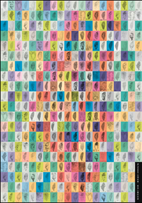
【Achievement & Map】Design Showcase
|
 Transformed through creativity, design is an artist’s aesthetic and Transformed through creativity, design is an artist’s aesthetic and
humanistic creation nourished by its intended culture. |
|
In the morning of December 24th, 2012, our parents took us 9 kids to Professor Pang-Soong Lin’s design exhibition which was held in southern Taiwan. One hour before the exhibition started, Professor Lin led a guided tour for us and we’d say that it’s our pleasure to have him as our teacher and learn from his works.
Apart from “Taiwan: My Homeland” which will be introduced separately in another webpage, other works by Lin are as followed:
1、Books:
 |
 |
 |
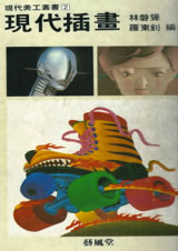
《Modern Illustration》
(1983) |
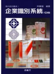
《Corporate Identity System》
(1985 YFT Publisher) |
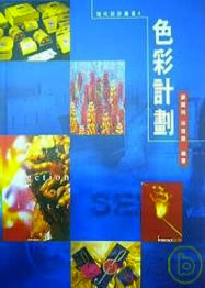
《Colors Planning》
co-author with Zheng
(1987 YFT Publisher) |
| |
|
|
 |
 |
 |
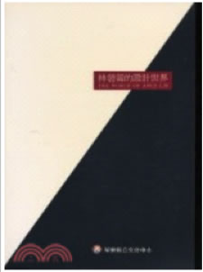
《Pang-Soong Lin’s World of Design》
(1995 Pingtung County Cultural Center) |
《 The Luminary of Design in Taiwan》
(2005 Ministry of Economic Affair, Taipei) |
《 Lin’s Maps of Design》
(2011 ARTCO) |
2、CI works:
Professor Lin has long been actively promoting CIS (Corporate Identity System) design as well as cross-straits art communication. From 1989 till present, he has been doing CI and brand image design for many corporations.
 |
1992 Chunghwa Telecom Co.,Ltd
Constituted by symmetrical telephone shape, the logo symbolizes two-way communication and message delivery while carrying the meaning of united power and concerted efforts of the corporation. The devotion for building up the telecommunication international network as well as providing attentive service is manifested by the horizontal lines within the globe. |
| |
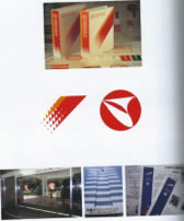 |
1989~2001 Taisuco
Adopting the strategy of “enhanced visual design”, the gradient image of pouring white sugar constitutes the logo of Taiwan Sugar Corporation. The warm colors of red and orange symbolizing the delicacy of food are employed in every design item, the new image of the company is established. |
| |
 |
1991 Eastern Cons. Co., Ltd.
The company was under its transformation with the focus switching from manufacturing to operational management while still emphasizing its Taiwanese industrial culture and image of the corporation. Therefore, the logo was developed along with the new operational philosophy. |
| |
 |
1996 The Great Wall Lubricating Oil
The logo is a combination of Chinese pinyin C.C and the initial letter G from Great Wall. It emphasizes the role of Great Wall Company as an energy power provider which enables the operation of all lives. The perennial vitality of the company could be seen by its rhythm-flowing lines. |
| |
 |
1996 Vantone Group
The logo which shows the swirl with laconic style is the symbol of abundant vitality and pursuit of advancement. Its balanced design delivers the modesty and inclusiveness qualities of the company. The Vantone Eye not only shows the inclination for upward mobility, but also gives voice to the devotion for quality living by the Vantone Group. |
| |
 |
1994 Ting Hsin International Group
The concept and creative strategy adopted when designing this logo are affected by the unique business patterns within inland China. Such “relation-oriented” mode of design (meaning the CI program which creates enterprise and social values at the same time) demonstrated the fresh outlook of both international and Chinese ambience. |
| |
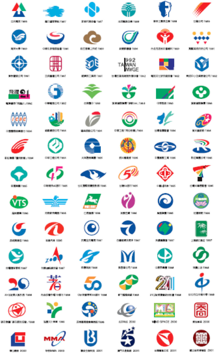
| More CI works by Lin: |
| |
 |
3、Poster:
During the period of making “Taiwan Image”, Professor Pang-Soong Lin created a series of posters that were characterized by Taiwan Island: The Drifting Taiwan, Colorful World, The Lost Taiwan, Green and Life Formosa, to name a few. Not only established his unique style of art making, Lin also made his Taiwanese design identifiable worldwide. To show his concerns about global issues, Lin continuously created several art works that are easier to understand.
 |
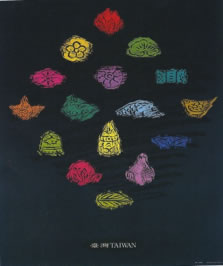
Taiwan
1991 81×60cm
This embroidered pattern made by strong calligraphy strokes probes into the factors of time and space, embodying designs of the ancient and the modern, the East and the West
|
| |
 |
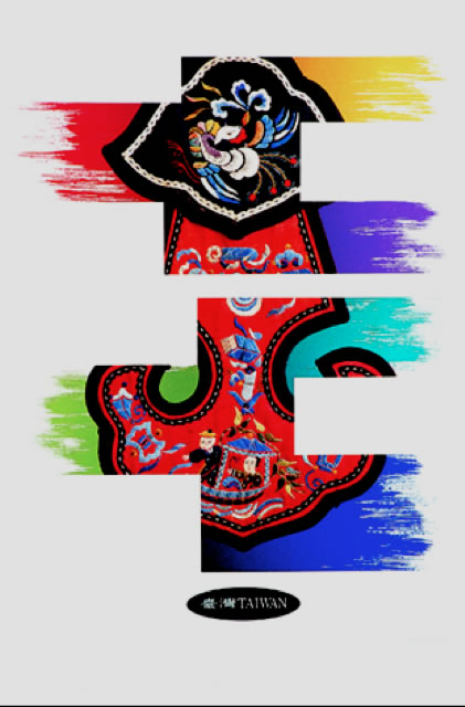
Taiwan
1991 81×60cm
Through various representations of colors, these engraved scrapings of flora and fauna made by Chinese traditional pastry molds show the fine tradition of respecting Nature and loving its people by the Taiwanese.
|
| |
 |
Taiwan Image
1992 81×60cm
Based on the folk tales told in Hakka villages, the poster which is composed with images of paper money depicts the difficult scene when our ancestors came across the strait to Taiwan.
|
| |
 |
Taiwan Image
1992 81×60cm
Getting the ideas from Chinese religious architectures, this item adopts the monumental style of forefront plaque of Chinese temples in which the embroidered patterns were embedded.
|
| |
 |
National College of Physical Education and Sports (now National Taiwan Sport University)
1992 81×60cm
The item emphasizes the combination of the traditional and the modern concept of physical education and sports spirits.
|
| |
 |
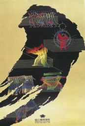
The Drifting Taiwan
1993 81×60cm
The image of Taiwan islands has become Lin’s distinctive trademark. This item is one of his most popular works, it was said that the idea of making this is when he found the resemblance of the floating clouds in Taiwan’s uncertain political situation.
|
| |
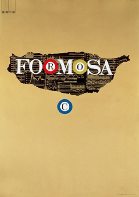 |
Island of the Insatiable Souls
1993 81×60cm
"FORMOSA", meaning the beautiful island in Portuguese, has been corrupted into “ROC: Republic Of Casino," reflecting the morbid phenomenon when the insatiable desires toward stock markets started to grow among people in 1993.
|
| |
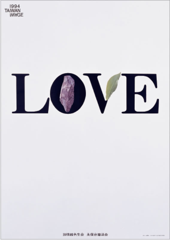 |
LOVE
1994 81×60cm
Performing with typography font design practices, Lin combined green leaves and stones with the word LOVE which concisely and accurately conveyed his design philosophy.
|
| |
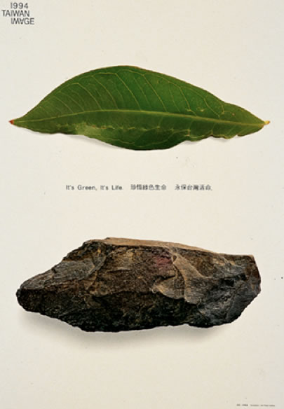 |
Green and Life
1994 81×60cm
A fresh green leaf and a hard stone, both have the potato shape resemblance of Taiwan island. The paralleled display of the two as the theme of "1994 TAIPEI IMAGE", this work shows the green Taiwan imagery.
|
| |
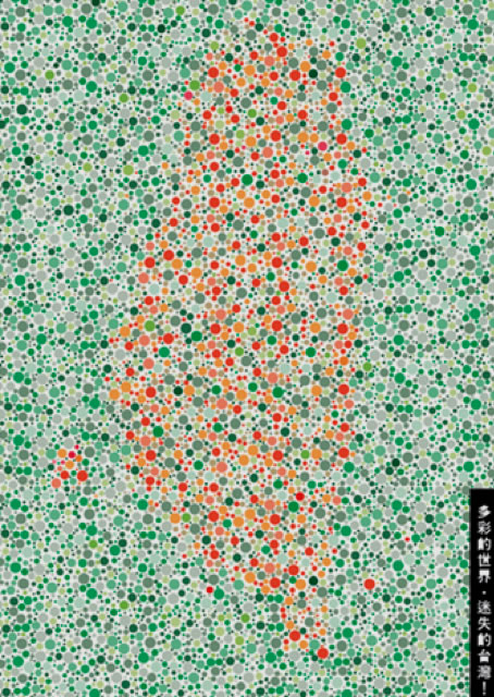 |
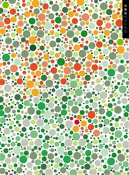
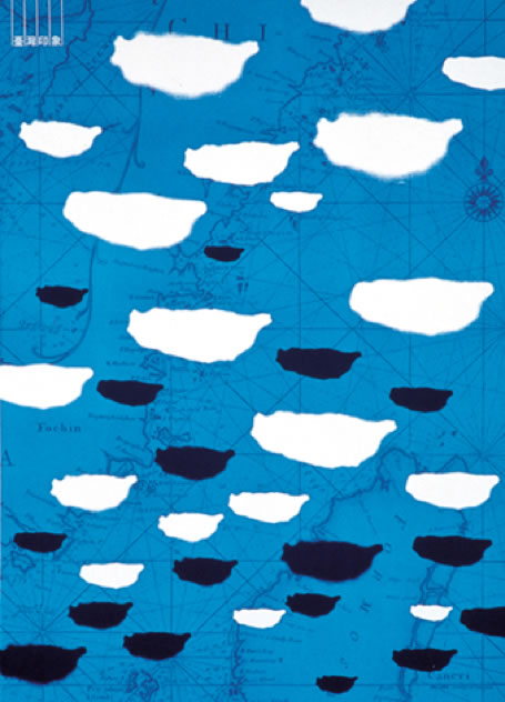
Taiwan: Lost in the Colorful World
1996 81×60cm
The use of Ishihara's color blindness checklist suggests people in Taiwan are lost in the colorful world.
|
| |
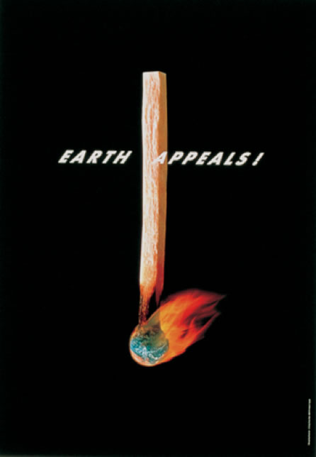 |
Earth Appeals
1997 81×60cm
Lin often shows his concerns regarding social issues in his works. “Earth Appeals” reflects the shortage of natural resources of which people often neglect while consuming it just like using a matchstick.
|
| |
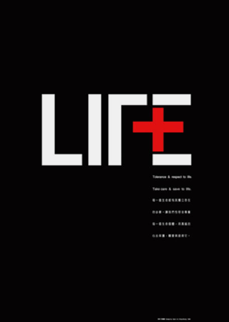 |
LIFE
1998 81×60cm
Ingenious combination of the word “LIFE” with the Red Cross symbol, the work is with its strong appeal that every life must be protected and taken care of with heart.
|
| |
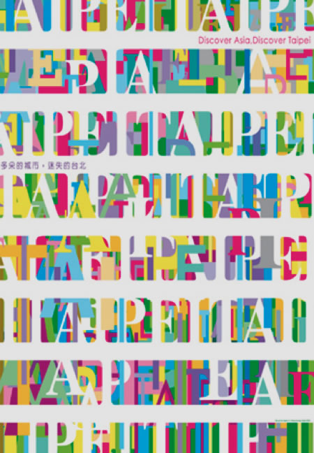 |
Colorful City: The Lost Taipei
2001 100×70cm
With the same font style of the cover of TIME magazine, the overlapping letters of vibrant colors constitute eight "TAIPEI" ribbons in the poster of which the idea of “Discover Asia, Discover Taipei” is clearly presented.
|
| |
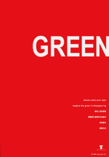 |
GREEN
2003 100×70cm
Along with the theme of "Green and Environmental Protection", the gimmick of the design lies in the afterimage of the green font color after gazing at the red poster.
|
| |
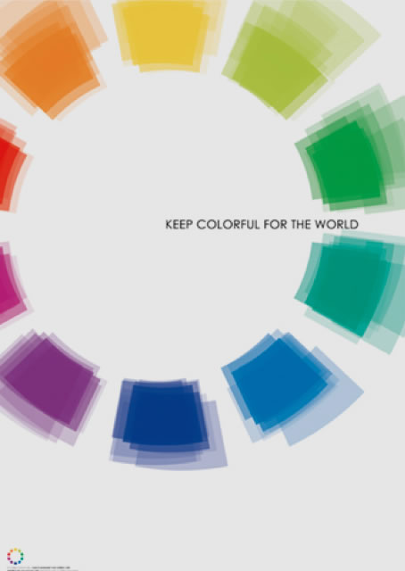 |
Keep Colorful for the World
Aichi International Exposition invitation posters
2005 100×70cm
Lin combined the design of color rings with the expo green sign with an aim to call for biodiversity maintenance on earth.
|
| |
 |
Wings of life
South-East Asia tsunami commemorative poster
2004 100×70cm
In 2005, Graphic Designers Association of Indonesia invited more than 100 designers worldwide to the poster designing event in memorial of the devastating tsunami in South Asia. From Lin’s poster we could see the gradual transformation of the ghosts of the cross turning into a flying pigeon, which symbolizes the freedom and ultimate peace for the souls.
|
| |
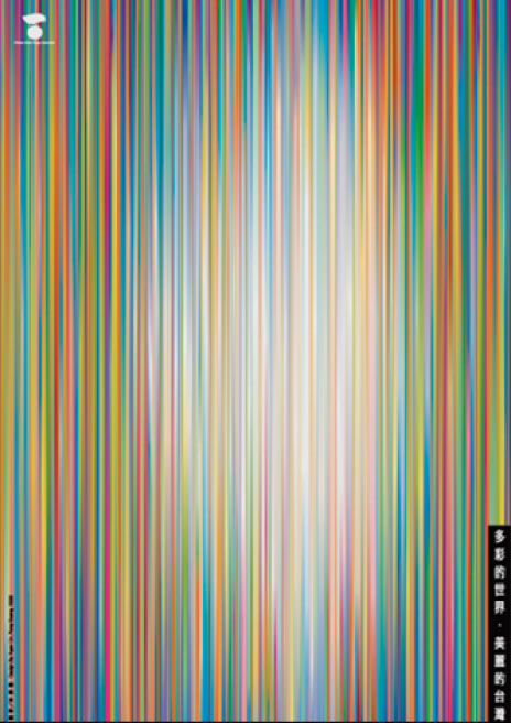 |
Colorful World: The Beautiful Taiwan
2005 100×70cm
Echoing with his previous work “Taiwan: Lost in the Colorful World” in 1996 which suggests people are ignoring the existence of their homeland Taiwan, this item with the halo effect of its colorful stripes remind us that we could find Taiwan wherever we are only if we care.
|
| |
 |
My Homeland: Letter to Taiwan
2009 100×70cm
Lin has been sending Taiwan postcards from around the world since 2007, this item shows his nostalgia for homeland even in the face of the colorful outside world.
|
| |
 |
Calligraphy Artistic Creation
2011 100×70cm
The work is a model of Asian Cultural-Creative Exhibition of which the free combination of hand-painted works and calligraphy constitute this artistic creation.
|
| |
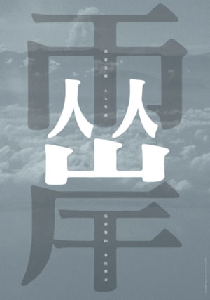 |
Cross Straits
2010 100˙70cm
With the Chinese proverb “Two brothers making individual effort in mountain climbing” the design rational, from the term “兩岸” (cross straits, suggesting China and Taiwan) Lin subtly combined the Chinese radicals “人” (people) and “山” (mountain) which successfully fit the image of the proverb that two brothers making individual effort in mountain climbing. Lin’s work is to emphasize that it’s the responsibility of both China and Taiwan governments to maintain cross-strait peace.
|
| |
|
|
|